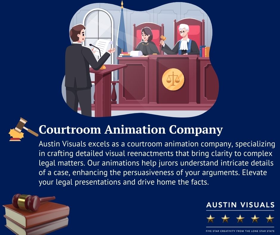
In the world of legal proceedings, visuals can be a game-changer. Imagine a courtroom where complex ideas are simplified, where evidence is presented with clarity, and where arguments are strengthened by compelling graphics. This is the power of effective courtroom graphics. In this blog post, we’ll dive into how to create effective courtroom graphics that leave a lasting impact in the courtroom.
What Is Courtroom Graphics?
Courtroom graphics, also known as trial graphics or demonstrative evidence, are visual aids that breathe life into complex information. They’re the secret weapon that can grab the jury’s attention, simplify intricate details, and solidify your case in their minds. Think of them as the PowerPoint presentations of the legal world, but on steroids (minus the cheesy clipart, hopefully).
Here’s the thing: crafting effective courtroom graphics isn’t just about throwing some colors and charts together. It’s a strategic dance between clarity, persuasion, and adhering to court rules. So, how do you create effective courtroom graphics that have the jury leaning in rather than reaching for their phones? Let’s dive into the nitty-gritty.
Steps On How To Create Effective Courtroom Graphics
Step 1: Know Your Audience (and the Judge!)
First things first, understand who you’re presenting to. Jurors come from diverse backgrounds, and legal jargon might fly over their heads. So, ditch the legalese and speak their language. Use clear, concise language, avoid overly technical terms, and explain complex concepts visually.
Remember, the judge is the gatekeeper. Make sure your graphics are not only persuasive but also admissible as evidence. Research your jurisdiction’s rules on demonstrative evidence – size limitations, animation restrictions, and so on. There’s nothing worse than having your masterpiece tossed out because of a technicality.
Step 2: Brainstorm Like a Boss
Gather your team – lawyers, paralegals, and yes, even a graphic designer if possible. Brainstorm the key points you want to emphasize with visuals. Is it a complex financial breakdown? A confusing sequence of events? Identify the information that would benefit most from a visual makeover.
Step 3: Choose the Right Weapon (a.k.a. Graphic Type)
There’s a whole arsenal of courtroom graphics at your disposal. Here are some popular choices:
- Timelines: Perfect for illustrating the chronological flow of events in a case.
- Charts & Graphs: Make numerical data sing! Bar charts, pie charts, and line graphs can present complex statistics in a digestible format.
- Diagrams & Illustrations: These can explain technical concepts or crime scenes visually.
- Photographs & Videos: Actual evidence speaks volumes. Enhance their impact with call-outs and annotations.
- Animations: Breathe life into complex processes or machinery malfunctions. (Use sparingly and ensure they’re scientifically accurate.)
Step 4: Design with Persuasion in Mind
Now comes the fun part – making your graphics visually appealing! Here are some persuasion powerhouse tips:
- Simplicity is Key: Avoid clutter. Focus on a single, clear message per graphic.
- Color Psychology Matters: Use colors strategically. Blue conveys trust, red grabs attention, and green signifies growth – choose the right tone for your message.
- High-Resolution is Your Friend: Blurry visuals scream unprofessional. Invest in high-quality images and graphics.
- Font Size Matters: Ensure jurors can read your text from a distance.
Step 5: Practice Makes Perfect
Before you unleash your visual masterpiece in the courtroom, rehearse your presentation. Practice with your graphics, ensuring smooth transitions and a clear narrative flow. Time yourself – you don’t want to go overtime.
Tips for Creating Compelling Courtroom Graphics
- Know Your Audience: Understand who will be viewing your graphics—judges, jurors, or both. Tailor your visuals to resonate with their level of expertise and understanding.
- Tell a Story: Every graphic should tell a story or support a narrative. Whether it’s illustrating a timeline of events or comparing data points, your graphics should contribute to the overall storytelling of the case.
- Use High-Quality Images: Invest in high-resolution images and graphics. Low-quality visuals can detract from your message and undermine your credibility.
- Accessibility Matters: Ensure your graphics are accessible to all viewers, including those with visual impairments. Use alt text for images and consider providing audio descriptions for complex visuals.
Want to read more about: “2D vs. 3D Animation: Choosing the Right Style for You” Visit our blog page now to know more!
Hire a Pro (If You Can)
While you can certainly create basic graphics yourself, consider hiring a professional legal graphic designer if your case hinges on complex visuals. They have the expertise to translate complex data into clear, impactful courtroom graphics. Keep in mind that courtroom graphics are powerful tools, but use them responsibly. Don’t manipulate data or use misleading visuals. Focus on clarity, accuracy, and supporting your case with impactful visuals.
So, there you have it! With a little planning, creativity, and these handy tips, you can create courtroom graphics that turn dry data into captivating narratives, leaving your jury – and hopefully the judge – thoroughly impressed. Now go forth and conquer that courtroom with the power of persuasion at your fingertips (or, rather, on your screen)!
Ready to level up your courtroom presentations? Austin Visuals offers expert graphic design services tailored specifically for legal professionals. Transform your case narratives into visually engaging stories that captivate judges and jurors. Say goodbye to confusing data and hello to clarity and impact. Partner with Austin Visuals today and make your next courtroom appearance unforgettable! Contact us now!


