
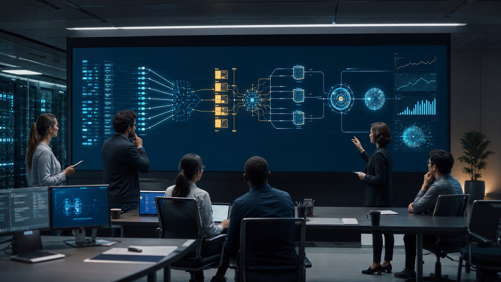
Machine learning workflow animation turns an ML system into a visible sequence, tracing how a business question becomes data, features, experiments, a validated model, a production service, monitored predictions, and eventually a retraining decision. The strongest version does not portray artificial intelligence as a glowing black box. It shows the handoffs, controls, evidence, and feedback loops that determine whether a model remains useful after deployment.
This matters because a production machine learning system is much larger than its model. Data collection, validation, transformation, orchestration, serving, monitoring, governance, and human review all influence the result. Animation gives technical and nontechnical viewers a shared map of that system while preserving the important distinction between an explanatory visual and proof that the model is accurate, fair, secure, or compliant.
Contact us at info@austinvisuals.com or call (512) 591-8024.
What Is a Machine Learning Workflow?
A machine learning workflow is the connected set of decisions and technical processes used to define a prediction problem, assemble suitable data, train and evaluate candidate models, deploy an approved model, generate predictions, observe real-world performance, and decide when to update or retire the system. It is better understood as a lifecycle than as a straight assembly line.
A typical machine learning lifecycle includes these stages:
- Define the user need, prediction target, constraints, and success measures.
- Collect, label, document, secure, and version relevant data.
- Validate data quality and transform raw inputs into usable features.
- Train candidate models and track their code, configuration, data, and results.
- Evaluate technical performance, operational behavior, risk, and human impact.
- Approve and deploy a model with a defined serving method and rollback path.
- Monitor inputs, outputs, latency, failures, drift, and business outcomes.
- Retrain, revise, pause, replace, or decommission the system when evidence requires it.
These stages overlap. A failed validation test can send work back to data preparation. A monitoring alert can trigger investigation rather than automatic retraining. A policy change can alter acceptable data or require a new review. A useful animation makes those branches visible instead of implying that every experiment proceeds smoothly to production.

Why Machine Learning Workflows Are Hard to Explain
The Model Is Only One Component
People often imagine machine learning as a dataset entering a model and a prediction emerging from the other side. In production, that central model is surrounded by ingestion systems, feature logic, validation tests, infrastructure, APIs, user interfaces, logging, security controls, and operational processes. Focusing only on model training hides the parts most likely to affect reliability in daily use.
Training and Inference Are Different Stories
Training uses historical or curated examples to estimate model parameters. Inference uses the deployed model to produce an output for new input. The data may arrive through different systems, at different speeds, with different quality checks. Combining both paths into one animated arrow can conceal training-serving skew, stale features, or a mismatch between experimental and production conditions.
Feedback Is Not Automatically Ground Truth
A click, purchase, appeal, operator correction, sensor reading, or delayed outcome may help evaluate a prediction, but each signal has limitations. Some labels arrive late. Some are influenced by the model itself. Others reflect human decisions or changing conditions. The animation should identify what the feedback represents and how it enters evaluation rather than depicting all user behavior as clean truth.
Several Audiences Need Different Levels of Detail
Data scientists may need experiment lineage and evaluation metrics. Engineers may need interfaces, batch schedules, latency, and failure behavior. Risk teams may need ownership, documentation, approvals, and escalation. Customers may need a plain explanation of what the system does and where a person remains involved. One validated source model can support multiple edits, but one crowded diagram rarely serves every audience.
The Eight Scenes a Machine Learning Pipeline Animation Should Show
1. Frame the Decision Before Showing the Data
The opening scene should state who uses the output, which decision it informs, and what a useful prediction means. A fraud score, equipment-failure forecast, product recommendation, image classification, and demand estimate have different consequences. Starting with the human or operational context prevents the technology from becoming the story’s unexplained hero.
Define the prediction target, acceptable response time, error costs, review process, and success metrics. Include important non-model constraints such as privacy, accessibility, security, explainability, and the ability to override or appeal an output.
2. Trace Data Provenance and Permissions
The AI workflow visualization should show where data originates, who is permitted to use it, how it is labeled, and which version supports each experiment. Sources may include transactions, sensors, images, documents, product events, public records, licensed datasets, or human annotations.
Instead of using a generic cloud of numbers, the visual can separate raw, curated, training, validation, and test datasets. It can also show exclusion rules, retention boundaries, sensitive fields, and lineage identifiers. These details make the workflow credible without exposing protected records.
3. Validate and Transform Inputs
Data validation checks whether incoming values conform to expected types, ranges, categories, completeness, freshness, and distributions. Transformation then converts approved inputs into model-ready features. Depending on the system, this may involve normalization, aggregation, encoding, tokenization, image preprocessing, or time-window construction.
An animation should distinguish a quality gate from a decorative cleaning effect. Show what happens to invalid records: quarantine, correction, rejection, fallback, or investigation. If feature logic is shared between training and serving, make that relationship explicit.
4. Make Experimentation Look Like Experimentation
A model training animation should show multiple candidate runs rather than one inevitable success. Each run combines code, a data version, feature definitions, a model family, hyperparameters, compute resources, and random state. The resulting artifacts and metrics must remain connected to those inputs if the team expects to reproduce or audit the result.
Visual branching works well here. Several candidates can enter a comparison area, while failed or dominated experiments remain recorded instead of vanishing. This communicates that selection is evidence-based and that a high-performing experiment still requires broader review.
5. Separate Evaluation From Approval
Evaluation can include predictive quality, calibration, robustness, latency, resource use, subgroup behavior, privacy, security, interpretability, and fit with the intended workflow. The appropriate tests depend on the use case. No universal score proves that a model is ready.
A production gate may require signoff from product, engineering, security, legal, risk, clinical, scientific, or operational reviewers. The visual should show the criteria and accountable roles without suggesting that an animation itself certifies the model.
6. Show Deployment as a Controlled Change
Deployment places an approved artifact into a serving environment. The system may generate predictions in batches, respond to individual requests online, run on an edge device, or support a human analyst. The animation should identify the serving path, feature retrieval, model version, output destination, and fallback behavior.
Useful rollout scenes include shadow testing, canary release, A/B testing, staged traffic, rollback, and approval checkpoints. A switch that flips instantly from laboratory to production omits the operational safeguards stakeholders often need to understand.
7. Monitor the System, Not Just the Accuracy Score
Production monitoring can observe input quality, feature distributions, output distributions, latency, throughput, errors, resource use, policy events, user feedback, and business outcomes. Ground-truth labels may be delayed or unavailable, so operational health and model quality often require different indicators.
Data drift means the distribution of inputs has changed. Concept drift means the relationship between inputs and the target has changed. Neither automatically proves failure, and a stable dashboard does not guarantee that the system remains appropriate. A scientifically plausible visualization should show alerts leading to investigation, not an alarm instantly fixing the model.
8. Close the Loop With an Explicit Decision
An MLOps process animation should end with more than a circular arrow labeled retrain. Monitoring evidence may lead to new data, revised features, a threshold adjustment, human-process changes, rollback, model replacement, or decommissioning. Retraining is one option, not a ritual.
Show who reviews the evidence, what conditions authorize a change, which artifacts are versioned, and how the updated model re-enters validation. This makes continuous improvement visible without implying uncontrolled automation.
How to Design an Accurate AI Workflow Visualization
Use a Visual Grammar With Fixed Meanings
Assign consistent shapes and motion to data, code, model artifacts, services, decisions, and human review. Use color to distinguish training from serving or approved from experimental states, but do not rely on color alone. Labels, icons, patterns, and narration should carry the same distinction for accessibility and grayscale viewing.
Animate State Changes, Not Ambient Activity
Particles flowing everywhere can make a system look active while explaining nothing. Motion should reveal a meaningful change: a dataset passes validation, a candidate is rejected, a version is deployed, a distribution shifts, or a reviewer authorizes rollback. Every animated event should answer a question.
Protect Sensitive Architecture and Data
The source package may contain production endpoints, proprietary features, customer information, security controls, or confidential model behavior. Before storyboarding, define what can appear, what must be abstracted, and who may review the files. Synthetic examples and simplified topology can preserve the lesson without reproducing protected information.
Label Illustrative Behavior
Conceptual heat maps, confidence gauges, attention-like effects, and animated feature contributions can be useful teaching devices. They should not be presented as actual model internals unless they are derived from an approved method and dataset. On-screen language such as “illustrative example” or “simplified view” protects the audience from confusing metaphor with measurement.
Choosing 2D, 3D, or a Hybrid Format
2D motion graphics are often best for architecture, ownership, lineage, metrics, and decision gates. They support labels and rapid comparison without adding unnecessary spatial complexity. A clean machine learning pipeline animation may rely primarily on 2D diagrams with carefully timed transitions.
3D becomes useful when the model is inseparable from a physical environment. Predictive maintenance, robotics, autonomous inspection, medical imaging, warehouse optimization, and industrial vision may need a realistic machine, facility, body region, sensor field, or product context. The 3D scene shows where data is generated and where the prediction changes an action.
A hybrid format can connect both levels. It may begin inside a facility, follow sensor readings into a 2D pipeline, compare model versions, then return to the equipment to show the approved operational response. The format should follow the communication problem rather than a desire to make every scene three-dimensional.
Production Inputs and Review Workflow
A strong project brief includes the intended audience, viewing context, approved system architecture, lifecycle owners, data sources, feature stages, experiment process, evaluation criteria, deployment method, monitoring signals, and the claims the video is allowed to make. Screenshots, notebooks, lineage diagrams, model cards, runbooks, interface mockups, and recorded subject-matter interviews can all help.
- Discovery: define the decision the viewer should understand after watching.
- Evidence map: connect every important statement to an approved source or reviewer.
- Script and storyboard: establish narrative, visual grammar, disclosures, and audience detail.
- Animatic: approve sequence and timing before detailed production.
- Technical review: confirm architecture, terminology, states, metrics, and simplifications.
- Visual production: create final 2D design, 3D assets, animation, voiceover, and sound.
- Delivery: export the master plus presentation, training, social, or silent-loop versions.
Why Choose Austin Visuals for Machine Learning Workflow Animation?
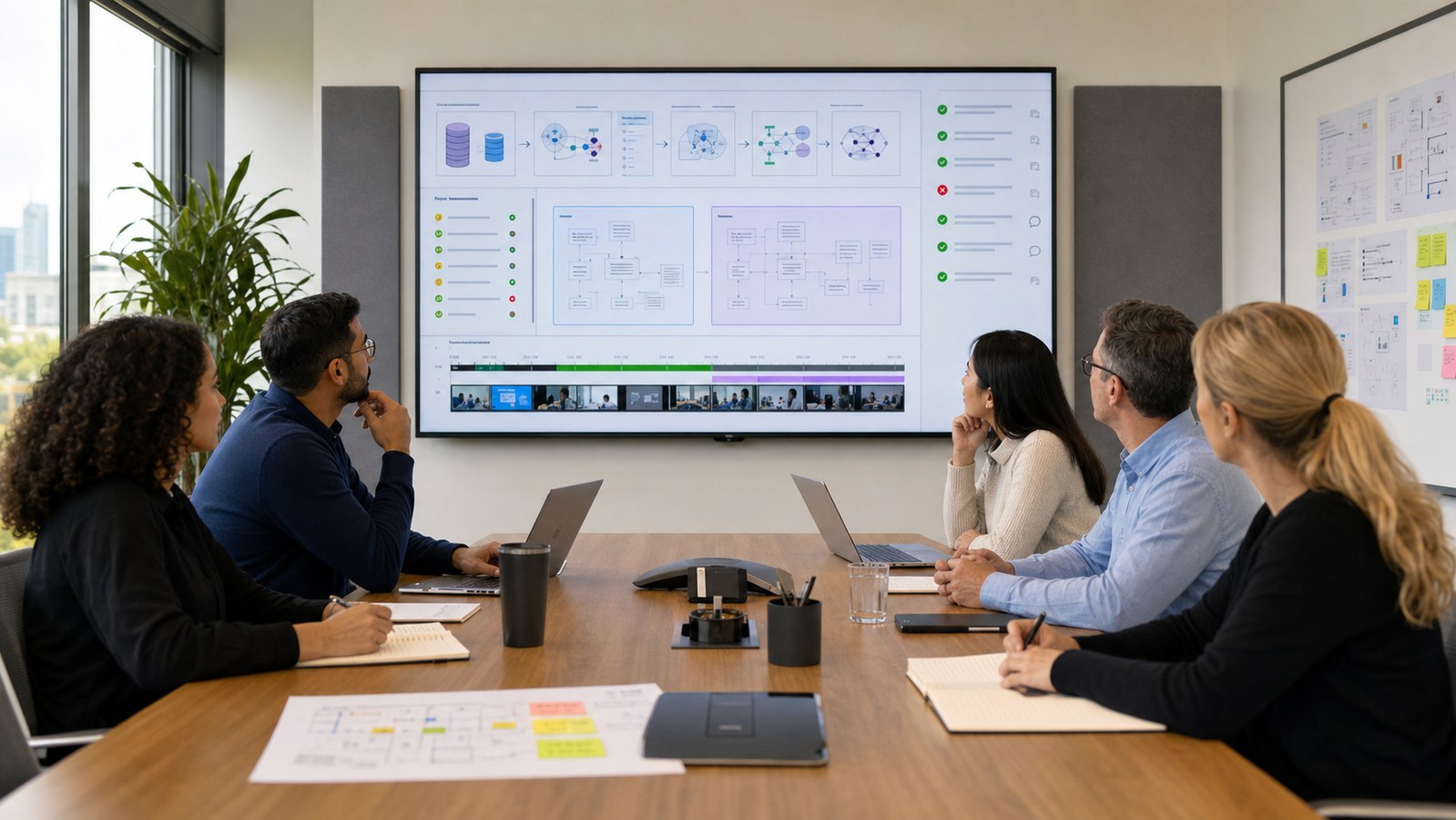
Austin Visuals approaches an ML workflow as an evidence-and-audience problem before treating it as a design problem. The production team can interview data scientists, product owners, engineers, operators, and governance stakeholders; convert their approved material into a passage-by-passage story; and build review gates around the claims each discipline owns.
For one project, that may mean a concise product animation showing how customer input becomes a recommendation. Another may require a training module that separates ingestion, feature computation, model serving, monitoring, and incident response. A third may pair a physical 3D environment with diagrams of the model lifecycle. The visual language is designed around the real use case rather than reused from a generic AI template.
Austin Visuals can coordinate scripting, storyboarding, 2D motion design, realistic 3D animation, interface visualization, narration, sound, captions, and multiple aspect ratios through one production plan. Learn more about explainer video production and B2B 3D animation services.
Our clients include:
Conclusion
Machine learning workflow animation is most valuable when it reveals the system around the model. A complete story begins with the decision and data, distinguishes training from inference, shows evaluation and approval, treats deployment as controlled change, and makes monitoring, investigation, retraining, and retirement part of the lifecycle.
The animation should help people ask better questions, not replace model documentation, testing, governance, or qualified review. When source lineage, operating states, responsibilities, and simplifications are handled carefully, the result becomes a practical communication asset for product adoption, staff training, customer trust, sales, and executive decision-making.
Contact us at info@austinvisuals.com or call (512) 591-8024.
Frequently Asked Questions
What is machine learning workflow animation?
Machine learning workflow animation is a time-based explanation of how an ML use case moves from problem definition and data preparation through training, evaluation, deployment, monitoring, and model change. It can show both technical components and the human decisions that control them.
What steps should an ML workflow animation include?
Most animations should include the user decision, data sources, validation, feature preparation, experiment tracking, model evaluation, approval, deployment, inference, monitoring, feedback, and a clear path for retraining, rollback, replacement, or retirement.
What is the difference between model training and inference?
Training uses examples to estimate a model’s parameters and evaluate candidate versions. Inference uses an approved deployed model to generate outputs for new inputs. The two paths may use different infrastructure and timing, so an accurate animation should show them separately.
How do you show data drift in an animation?
Data drift can be shown by comparing approved baseline input distributions with newer production inputs, then routing the change to an alert and investigation. The visual should not imply that every distribution change proves model failure or automatically requires retraining.
Should a machine learning animation use 2D or 3D?
2D is usually best for pipelines, metrics, ownership, and decision gates. 3D is useful when the model interacts with physical equipment, a facility, anatomy, robotics, sensors, or a product. Many technical projects benefit from a hybrid of both formats.
What source files are needed to create an ML workflow animation?
Useful sources include architecture and lineage diagrams, approved terminology, interface captures, model cards, experiment summaries, monitoring views, runbooks, product requirements, review policies, and interviews with the people who own each lifecycle stage.
How long does a machine learning workflow animation take?
A focused 2D workflow may take four to six weeks. A hybrid production with custom 3D assets, several audiences, detailed technical review, narration, or multiple deliverables may take six to ten weeks or longer. Source readiness and reviewer availability strongly affect the schedule.